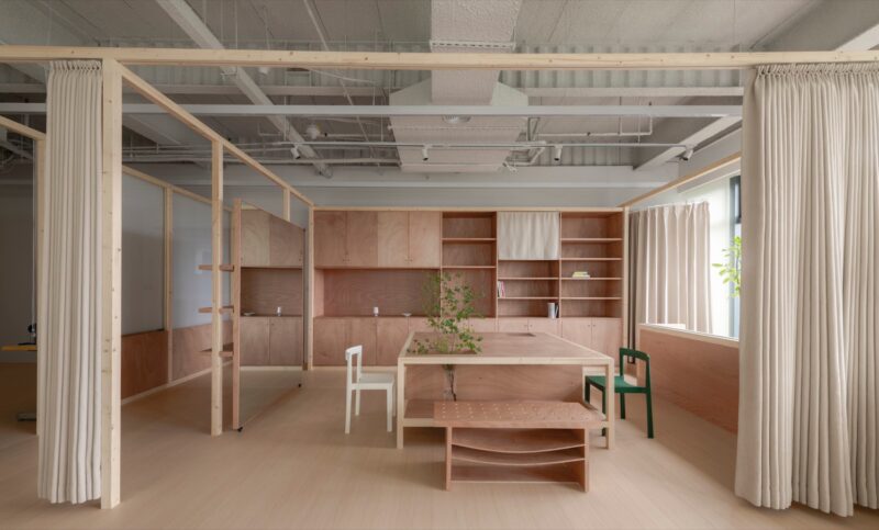
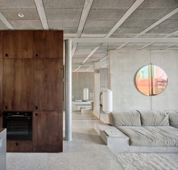
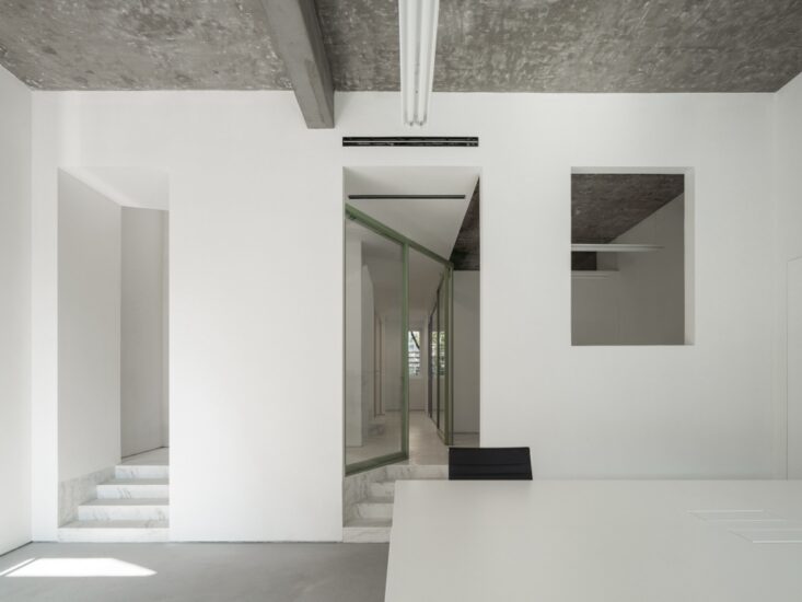
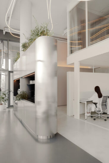
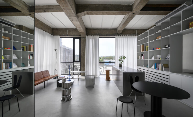
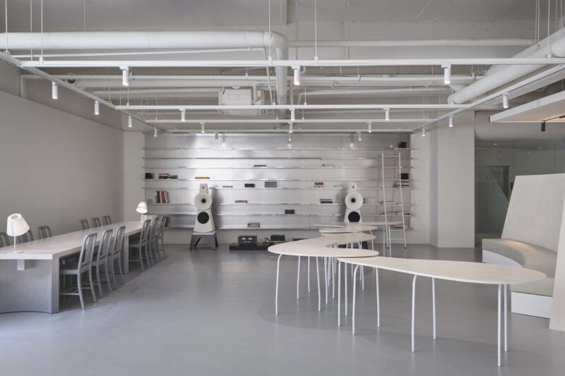
巴塞罗那poblenou社区有着丰富的工业建筑遗产,这些具有当地特色的建筑由创意空间montoya设计。这座建筑曾是20世纪西班牙最大工业综合体之一的仓库,现在由室内设计师skye maunsell和工业设计师jordi veciana进行改建设计。该工作室的设计重点是室内设计,产品设计和照明设计。在Motoya空间设计中,有着许多具有代表性的设计案例,且它作为一个有影响力和创造性的集体策展工作空间,它的设计能更好地促进当地文化家园的发展。
the rich industrial architectural heritage of barcelona’s poblenou neighborhood is expressed through the curated creative space, montoya. once a warehouse within one of spain’s largest industrial complexes from the 20th century, the relic has been transformed by interior designer skye maunsell and industrial designer jordi veciana. the design studio of the duo has a key focus on interior design, product design and lighting. motoya demonstrates a programmatic ambiguity, serving as a curated workspace for an influential and creative collective as well as a cultural home for a diverse program of interests and events.
在montoya的设计中,maunsell和veciana俩位设计师的共同目标是创造一个具备启发性的创意空间,以此塑造一个具备发现创意、塑造创造力和发展新思想的办公环境。同时,设计师jordi veciana还说道:“虽然montoya是作为一座仅有三层建筑的办公空间,但是它同时也提供了各种满足办公需求的功能。不管是在办公环境还是在居住环境中,我们总是对具备多种用途的空间产生兴趣。设计师们也提出创造一个空间,不仅让它成为一个工作空间,而且还能作为一个生活空间,或者一个可以与其他专业人士见面的地方。在一个空间阅读,工作是需要要集中精神的,所以我们创造了这个可以令人放松愉悦的办公环境。这种空间我们没有把他具体的定义为是用作办公还是生活或者是其它用途,所以这种缺乏定义的有趣之处在于,它对任何变化或主动性都持开放态度,并且能够适用于各种空间的用途。我认为它缺乏定义比仅仅把它定义为一个传统的办公空间更有趣。”@jordiveciana
in the design of montoya, the goal of maunsell and veciana was to create a space that inspires; an environment in which to discover, shape, and develop new ideas. designer jordi veciana elaborates: ‘montoya is a three story building and, as a space, it has many functions. we have always found interest in spaces with many uses. to create a space that can not only be a working space, but a living space, or a place to meet with other professionals. it must be calm, to concentrate. a space to be in, to read, to work. this is a necessity so we created this space. what’s interesting about this lack of definition is that it is open to any change or any initiative and it can adapt. I think its lack of definition is more interesting than just defining it as a traditional office space. ’@jordiveciana
在montoya这个巨大的空间中,设计师将墙面进行了许多留白的处理,仿佛成为了一张空白的画布,这种留白的空间设计为设计者们提供了自由、不受约束的工作环境。设计师保留且利用了建筑本身的原始材料,建筑材料表面粗糙的纹理及墙壁上的油漆碎片与当代家具和灯具款式进行搭配,裸露的砖拱顶和原始的木材椽的结合是为了向当地的遗产致敬,产生出了另外一种美感。skye maunsell继续说道:“虽然现在我们知道我们想要做什么,但是也许随着时间的推移,这钟想法将会改变,这取决于人们对空间的使用、对空间的存在以及对我们的设计的理解。我们不想说建筑设计具体是应该这样建造的,还是说应该那样建造,而是我们想让它呼吸,自由地建造。”@skyemaunsell
as the enormous space is designed as a blank canvas, creative partners feel freer, less constrained. there is an authenticity to the material rawness of the building that the designers had maintained and taken advantage of. course surface textures with paint that chips on the walls compliment the contemporary furniture pieces and lighting fixtures. exposed brick vaulting as well as original timber rafters express the heritage of the site. skye maunsell continues: ‘we know what we would like to do and maybe that will change over time based on how people will react to using the space, being in the space and giving us feedback. we don’t want to say it is specifically this. we want to allow it to breathe and to build naturally.’ @skyemaunsell
folch studio工作室的创意总监albert folch评论道:“每次我试图向别人解释montoya空间是用来做什么的,都很难解释的明白。为什么很难解释,那是因为这个工作的环境是现代,新颖的。在这个空间中我们有这么多桌子,而且我们以很高的价格租来,一张大桌子成本很高,一张小桌子成本很低。但是不管是哪些物品,他们自身可以创造出不同的价值,他们可以被用来做复杂有趣的事情。这是一个新概念,不容易被具体定义的。”
creative director albert folch of folch studio comments: ‘everytime I try to explain to someone what montoya is, it’s very difficult to do so. but if it’s hard to explain it’s because what they’re doing is truly new. it’s easy to explain a co-working space: we’ve got this many tables, we rent them for this much, a big table costs more, a small one costs less. but what they’re doing is so much more intricate and more interesting. it’s a concept that is new, not easy to define.’

完整项目信息
项目名称:Design of Barcelona industrial warehouse
项目位置:巴塞罗那
项目类型:建筑改造/联合办公空间
使用材料:水泥、油漆、木材
设计团队:skye maunsel & ljordi veciana
摄影:salvalopez


