我作为一个空间设计师工作了几十年,我意识到与人的关系以及在与人的关系中所做的一切都是重要的。我认为在人际关系中连接一切的媒介是“同理心”。我第一次见到客户时谈了很长时间。在决定合作之后,我们继续多次交谈,客户分享了很多故事。当时,他的工作性质和病人是他故事的主要主题。我觉得他想要别人强调他的某些东西,同时自己也要同情别人的某些东西。
I have been working as a space designer for decades, and I realized that relationships with people and everything that is done in the relationships with people are important. And I think that the medium that connects everything that is done in relationships is ’empathy’. I had a long talk when I first met with client. We continued to talk many times after deciding to work together, and client shared many stories. At that time, the nature of his job and patients were the main topics of his stories. I felt that he wanted something of his to be emphasized with another person and also himself empathize something of another person.
我们参加的会议越多,我开始认为,随着时间的流逝,能够在内心感受到并自然而然地融入其中的东西,比被迫、说服或理解的东西更能给人留下持久的印象。然后我开始设计,希望这个空间能成为一个让来到这个诊所的病人感到平静的地方,可以谈论他们的一切。
The more meetings we had, I came to think that as time passes, more than something being forced, persuaded or understood, things that can be felt in the heart and soaks in naturally leaves a longer lasting impression. I started designing hoping for the space to become a place where the patients who come to the oriental medicine clinic feel peaceful and be able to talk about everything about them.
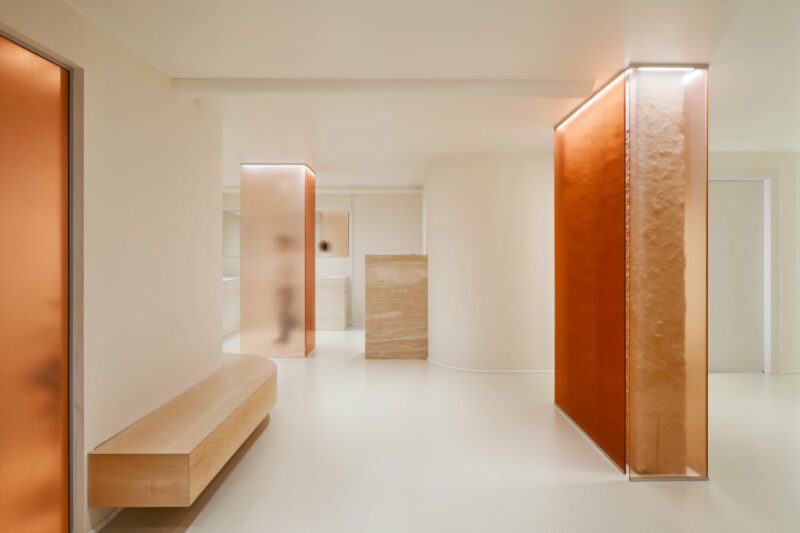
为了创造这种感觉,在空间中有三个点是可视化的。
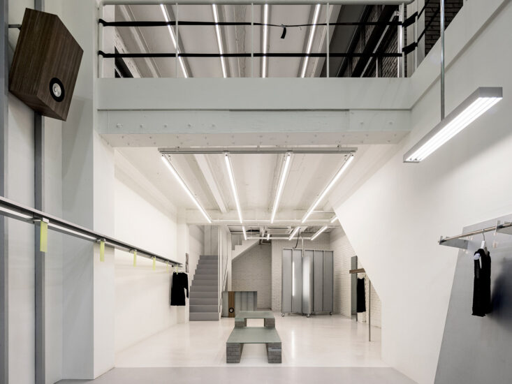
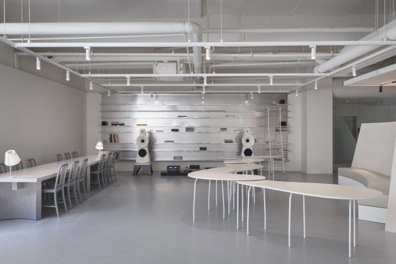
首先是空间的简化结构。除了功能结构,我们想要取出装饰结构。我们希望诊所的结构所传达的信息简洁明了,不需要任何华丽的语言。
To create that feeling, there are three points visualized in the space.
The first is the simplified structure of the space. Except for functional structure, we wanted to take out the structures for decoration. We wanted the message given by the structure of the ‘Aeichi Korean Medical Clinic’ to be concise and simple, that did not need any florid language.
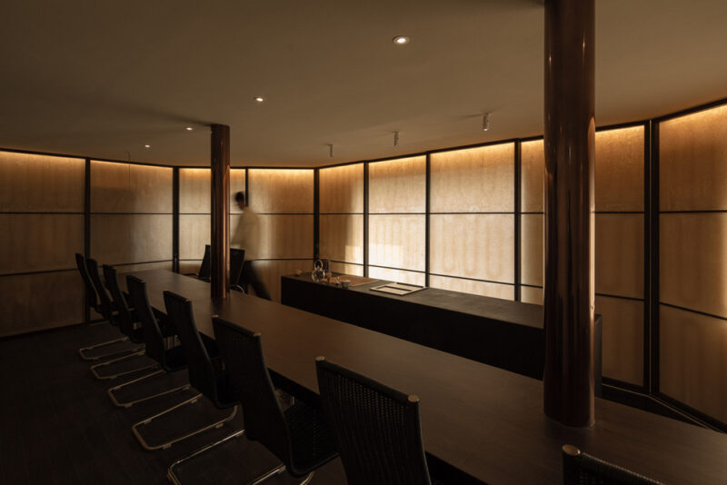
第二个是通信设备。 我们使用物体打开空间并让光线浸透,以便通过自然地欢迎外部元素,外部光线可以渗透到空间中而不会干扰生活方式,也可以自然地识别空间中的白天变化。 此外,墙壁部分打开,门被最小化到不影响功能的程度。我希望通过开放部分,能够形成一种超越空间的情感交流或同情纽带(即使不是视觉交流)。我认为广泛地观察这个空间给了一个额外的元素,带来了视觉交流的图像。
And the second is the devices for communication. We used object to open the space and to let light soak in so that by welcoming the outside elements naturally the outside light can permeate into the space without disturbing the lifestyle and also to naturally recognize the changes of the day in the space. In addition, the walls are partially opened and doors are minimized to the extent that they do not harm the function. I hoped that through the open section, an emotional communication or bond of sympathy (even if it is not visual communication) beyond space could form. And I think that looking at the space widely gave an extra element that brought out an image of visual communication.
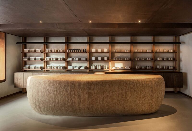
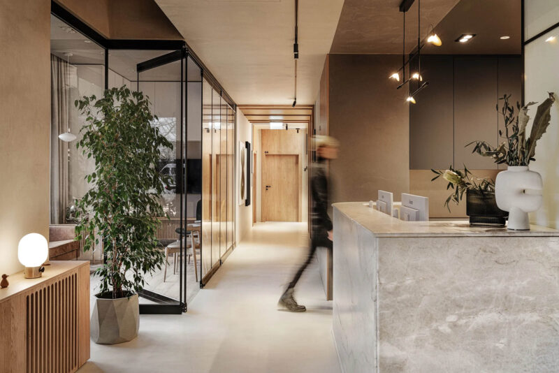
最后,我们使用了一种熟悉的、温暖的材料,不会让任何人感到不安。新的和有趣的材料不断涌现,但我认为熟悉和友好的材料应该符合诊所的信息。
Finally, we used a familiar and warm material that isn’t discomforting to anyone. New and interesting materials continue to emerge, but I thought familiar and friendly material corresponded with the message of ‘Aeichi Korean Medical Clinic’.
完整项目信息
项目名称:
项目位置:日本爱知县
项目类型:群体住宅/住宅重建
设计公司:studio velocity (Japan)
设计团队:KENTARO KURIHARA + MIHO IWATSUKI
摄影:studio velocity


