LOFT中国感谢来自杭州术锐室内设计的商业案例分享:
男人是一种什么样的生物?有时候,男人非常简单,就如同一个规整的序列,逻辑观念强,一通到底,规规整整。但男人也同时非常复杂,男人的脑子里藏着各种数据、万千成分,也或者藏着整个宇宙,有时候连他们自己也搞不懂自己。
What kind of creature is a man? Sometimes, men are very simple, just like a regular sequence, the logic of the concept of a pass in the end, rules and regulations. But men are also very complicated at the same time. Men’s minds contain all kinds of data, thousands of components, or the whole universe, sometimes even themselves.
但是这种矛盾感,本身是迷人的。偶尔迷糊,偶尔清醒。偶尔认真,偶尔纨绔,捉摸不定,才迫使人去一步步了解。
But this sense of contradiction itself is charming. Occasionally confused, occasionally awake. Occasionally serious, occasional stupid, unpredictable, forcing people to step by step understanding.
有魅力的男人,是棱角分明的,有着距离感、严肃感,深邃而却又散发着致命的吸引力。而其实,再成熟的他们,内心也有彷徨无措,仿佛是一个不知道如何去选择的、惊慌的小男孩。
所以,男人这种生物,简单而复杂,规整而繁乱。
Charismatic man, is angular, with a sense of distance, a sense of serious, deep and yet exudes a fatal attraction. And in fact, and then they mature, the heart also have a loss flawless, as if one does not know how to choose, panic little boy.
Therefore, men, such creatures, simple and complex, regular and chaotic.
魅影重重,暗色的调是他的基调。着迷,如同黑夜与银光,忍不住想要探寻他内心的世界。
他的世界,是一个乾坤。
Phantom heavy, dark tone is his tone. Fascinated, as the night and silver, could not help but want to explore his inner world.
His world is a universe.
该空间性质为男装店铺。趋于对后现代的解构主义的理解,设计灵感来源于三组反差性的关键词:矛盾、融合,有序、无序,解构、重组。
The space for men’s clothing shop. Tending to the deconstruction of postmodern understanding, the design inspiration comes from the contrast of three key words: contradiction, integration; orderly, disorderly; deconstruction, restructuring.
空间特有的纯粹宁静,搭配以理性的手法和低度设计,耐看又带有less is more 的设计理念,不做线板,让陈列空间保持利落,简单,没有花哨的装饰博人眼球,但自然形塑的简约美学又让人印象深刻。
Unique pure quiet space, with a rational approach and low-level design, patience and with less is more design concept, not board, the exhibition space to keep neat, simple, no fancy decorative blog eye, but naturally Shaping simple aesthetic and impressive.
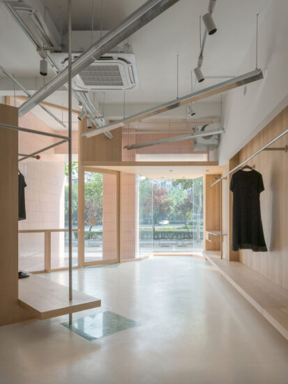
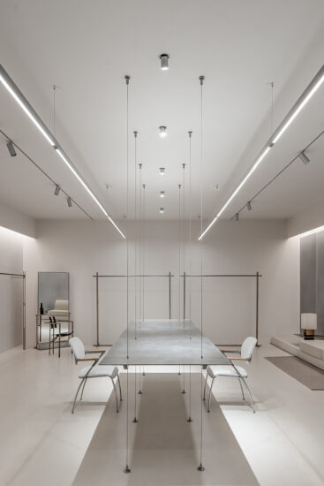
空间展现出的主要材质是不锈钢、金钢水磨石、水泥色艺术漆和原建筑的水泥色,色调既是融合,质感既是矛盾冲突。
The main material presented in the space is stainless steel, a steel terrazzo, a cement art paint, and a cement color of the original building. The colors are both blended and the texture is both contradictory.
水泥饱满的灰度及细腻的质感犹如复制粘贴般真实,但是水泥并不张扬,不喧闹,不喧宾夺主,像一位隐居的居士一样,无惧与闹市融合,也能守得住那份清幽。正如我们一直传达的设计人文理念一样,得到最大限度的融合与阐释,传递着高端品质人生的精神,经久不衰,历久弥新。
Full of grained cement and delicate texture like copy and paste as real, but the cement is not publicity, no noise, not overwhelming, like a seclusion of lay people, fearless and downtown integration, but also keep the share quiet. As we have been conveying the concept of human design, like the same, get the maximum integration and interpretation, delivering the spirit of high-quality life, enduring, everlasting.
水泥在很多时候并不被世人理解,冷冷的基调,做旧的色彩,一种不走寻常路的风格,通过巧妙的设计,水泥则披上了神秘面纱,赋予时尚、文艺、历史的厚重感,逆袭成为时尚潮流的前线,对于墙面,世人厌倦了千篇一律的壁纸,反而水泥给人以最本质的美感,比奢华的装饰来的更有艺术感,体现自然,不羁,朴实无华的艺术品味。
Cement is often not understood by the world, cold tone, old colors, a style that does not take the unusual way,By clever design, cement is covered with mystery, given the heavy sense of fashion, art, history, fashion has become the front line of counter-attack,for the walls, people are tired of the monotony of wallpaper,Instead, cement gives people the most essential sense of beauty, which is more artistic than luxury and rich decoration, reflecting the natural, uninhibited, unpretentious art tastes.
而不锈钢和水磨石的材质又为整个空间多了几分刚强,坚不可摧,矛盾错杂,又相互连结,不锈钢的材质肌理变化非常微妙,表面经过处理后,复古的工业风味道更浓。
The stainless steel and terrazzo materials for the entire space more than a bit strong, indestructible, contradictory and complicated, but also linked to each other, the texture of stainless steel material changes are very subtle, the surface after treatment, the retro industrial flavor thicker.
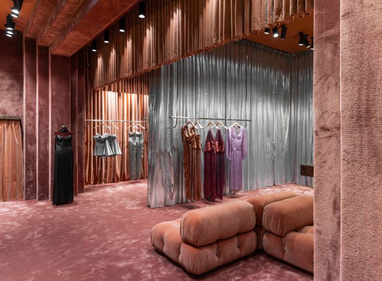
根据规则图形的先解构再重组,构成店铺内的道具和顶部的造型结构。不锈钢加灯光结构的体块造型穿插在顶部,与原建筑水泥房梁的视觉冲突体现出无序感。不规则的道具排列于空间中又展现出有序的节奏。用光影整合所有的视觉上的复杂矛盾感受,体现更加丰富的秩序凌乱感。室内整体空间由大块面的银灰色墙和立方体,三棱柱的陈列柜构成,配以银色管架,再缀以白色块状照明,这其中不规则的银色锡箔,使得空间的点线面关系明确又不孤立,壁面的“凹”与地面的“凸”更是相映成趣,实现了整个空间的丰富与节制。
Deconstruction and reorganization according to the rules of the graphic first, constitute the shop props and the top of the shape of the structure. Stainless steel plus light structure body shape interspersed with the top, with the original building cement beams visual conflict reflects the sense of disorder.Irregular props arranged in space and show an orderly rhythm. Integration with complex and contradictory feelings of light and shadow on all the visual clutter reflect a richer sense of order.The overall interior space consists of large silver wall and cube, triangular prism display cabinet, together with the silver tube rack, then decorated with white block lighting, of which irregular silver tin foil, making the space point-line surface clearly not isolated, the wall of the “concave” with the ground “convex” is side by side to achieve a rich and moderation throughout the space.
完整项目信息
项目名称:易写男装
项目面积:200㎡
项目位置:中国,杭州
完成时间:2017.12
使用材料:不锈钢,水磨石,水泥色艺术漆
项目设计:杭州术锐室内设计有限公司
设计团队:郑杰 曾中明 孙淑婷


