Studio Boscardin.Corsi Arquitetura设计了一个名为新型创新微型咖啡馆,为巴西的繁忙都市工作者提供一个快速而愉快的地方,让他们可以享用他们喜爱的饮品。
A new and innovative miniature cafe called the coffee has been designed by Studio Boscardin.Corsi Arquitetura to give busy city workers in Brasil a quick but enjoyable place to stop for their favourite beverages.
这个超小型咖啡馆的目标是利用非常小的城市空间,同时为都市人提供他们想要和享受的东西。 咖啡是巴西的一家微型咖啡馆,采用空间效率和环保材料的理念,建立了一个咖啡馆最小化所需的地方,并且可以随意安排,让他们在创纪录的时间内为客户提供订单。 步行窗口式服务甚至不需要他们在下次会议途中停下来打开门。
The goal of this ultra tiny cafe was to take advantage of very small urban spaces while also providing urbanites with something they want and enjoy. the coffee, a micro-cafe in Brasil, is built using ideas of space efficiency and eco-friendly materials to establish a place where baristas have what they need in minimum and arranged accessibly, letting them provide customers with their orders in record time thanks to the walk-up window style service that doesn’t even require them to stop and open doors en route to their next meeting.
在拥挤不堪、基本上没有扩张空间的市中心,新商业店铺的发展空间往往也非常有限。这就是为什么这个项目团队决定充分利用存在于古老城市建筑的角落和缝隙中的微小空间。他们改造了原先无法使用的小服务门,在两家餐厅之间没有优雅和风格的边缘,并把它变成了一个很有潜力的生意。
In packed city centres where there is essentially no room for expansion, there is often also very limited room for new businesses. That’s why this project team decided to make full use of what tiny space does exist in the nooks and crannies of old urban architecture. They transformed a small service door that was formerly unusable, edged without grace or style between two restaurants, and turned it into a business with a lot of potential.
咖啡厅的设计和空间组织是基于日本简单和极简主义的价值观。当然,有很多地方可以让你快速地喝到外带咖啡,但是这个特殊的行业把这个想法提升到了一个新的高度。只要拿着你的现金走到室内-室外的窗户前,喝杯咖啡就可以了,甚至不用穿过里面的门厅。
The design and space organization of the coffee was based on Japanese values of simplicity and minimalism. Sure, there are plenty of places that will make you a quick takeaway coffee, but this particular business takes that idea to the next level. Simply walk up to the indoor-outdoor window with your cash and leave with a coffee without even having to walk across an inner foyer!
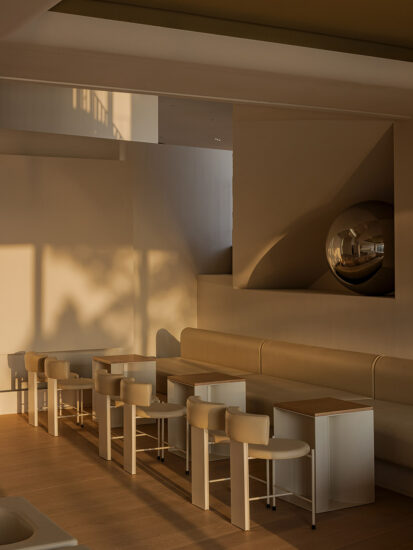
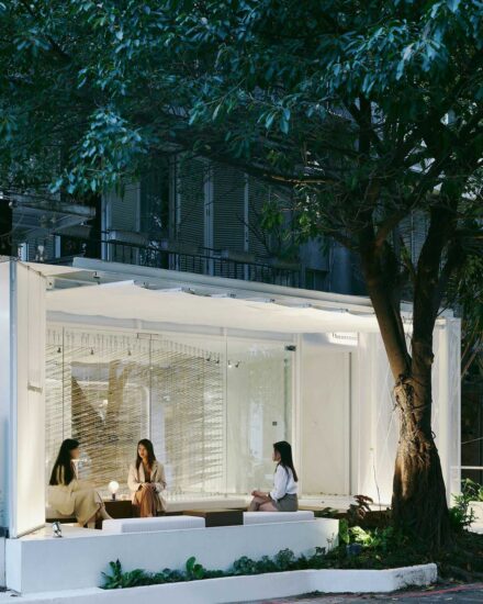
不过,如果你真的有时间想坐下来,咖啡已经巧妙地安排在了一个公共长椅丰富、城市生活景观优美的地方。这是一个店面将自己整合到已经存在的空间中的最终例子。
Just in case you actually do have a moment and you want to take a seat, however, the coffee has strategically placed itself in an area that’s rich in public benches with nice city life views. It’s the ultimate example of a business integrating itself into an already-existent space.
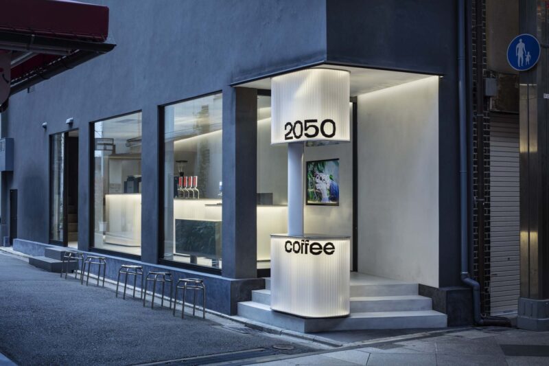
尽管咖啡的物理空间是极简主义的,只留下绝对实用和必要的空间,但该店面的立面并没有在街上消失。部分原因是,设计师选择在视觉上向上建造,而不是向外扩张。因此,窗户和指示牌都很高,无论空间多么狭小,从人行道上都能看到它们,也很有趣。
Despite the physical space of the coffee being minimalist and leaving room only for what’s absolutely functional and necessary, the business’s facade is not lost on the street. Part of what makes it fit so well into the tiny urban space is the designers choice to visually build upwards, rather than expanding outwards. As such, the window and the signage reach high, making them visible and interesting from the sidewalk regardless of the narrow space.
超现代的风格也帮助店面从其他建筑中脱颖而出。设计师使用了纯白色的配色方案和光线,以及金属、木材和亚克力,创造了一个非常明亮的空间,并从大多数城市的大量灰色混凝土和污迹玻璃中直观地勾勒出这个空间。
Ultra modern styling also helps the business stand out from the other buildings. Designers used stark white colour schemes and light, as well as metal, wood, and acrylic, to create a space that is very well lit and visually delineated from the abundance of grey concrete and smudged glass most cities are home to.
在室内,咖啡厅的空间只有三平方米,留给有限的可能性,一个功能布局,实际上为客户提供了快速、优质的服务。设计师非常小心地放置咖啡师的工具和要求,确保几乎不需要移动。所有的东西都在手边,咖啡师甚至很少会背对着窗户和顾客!
Inside, the coffee exists in a space of only three square metres, leaving limited possibilities for a functional layout that actually provides customers with a quick, quality service. Designers were careful to place the barista’s tools and requirements just so, making sure very little movement is required. Everything is always at hand and the barista rarely even has to turn their back on the window and their customers!
顾客在平板电脑上下单,这意味着顾客在选择饮料和等待的过程中总是在移动,而不是在咖啡师结账、处理和下单的过程中陷入长队。咖啡师专注于他们的工作和产品的质量,而顾客则享受着咖啡厅窗外的城市空间。由于其对小空间的独特使用,这使得业务不仅仅是架构上的创新;这也是一种独特的体验!
Orders are placed on a tablet, meaning that customers are always in motion while they choose their beverage and wait, rather than getting caught in long lines while the barista rings up, processes, and makes their order. The barista concentrates on their tasks and the quality of their product while customers enjoy the urban space outside the coffee’s window. This renders the business more than just an innovation in architecture thanks to its unique use of small spaces; it’s also a unique experience!
完整项目信息
项目名称:巴西Ultra Modern Walk-Up Cafe
项目类型:餐饮空间丨咖啡厅
项目位置:巴西
完成时间:2018
项目设计: Boscardin.Corsi Arquitetura
使用材料:金属、木材、亚克力、瓷砖
摄影:Eduardo Macarios


