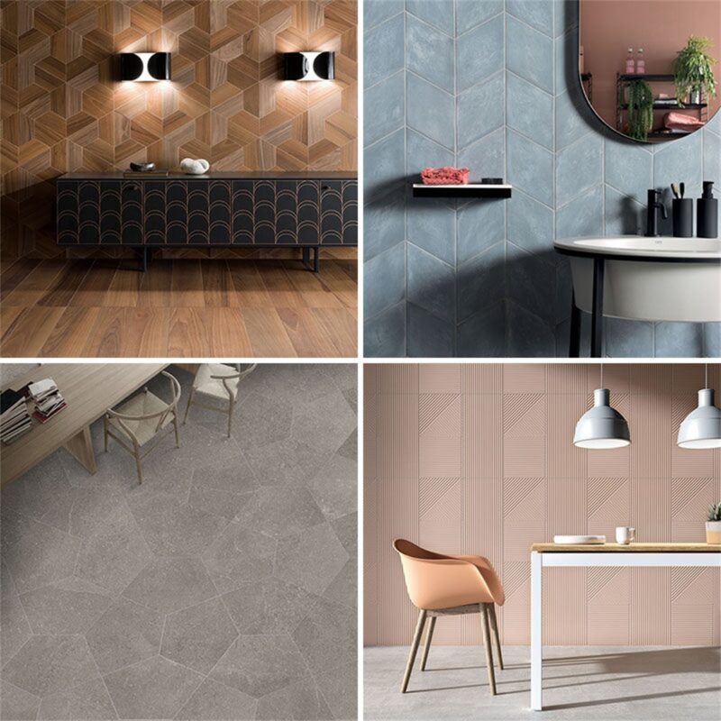
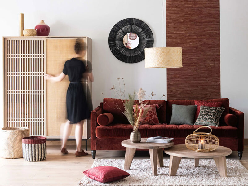
新的一年已经到来,各大油漆制造商和色彩预测机构已经推出了各自的2019年年度色彩。从冷灰色到温暖的赤褐色,再到橙色的色彩范围,这五种颜色趋势有望在2019年主导设计和制造行业。
1.Sherwin-Williams——Cavern Clay SW 7701
Sherwin-Williams对2019年度色彩的描述是向世纪中期的现代风格致敬。“Cavern Clay代表着重生,简约,自由奔放和波西米亚风格。”Sherwin-Williams的色彩营销总监Sue Wadden说。这种温暖的陶土色调是接地气的,受欢迎的,精致的,并与温暖的灰色、深褐色、中音蓝色,和温暖的中性色很好地搭配。
“A nod to mid-century modern style” is how Sherwin-Williams describes its 2019 color of the year. “Cavern Clay embodies renewal, simplicity, and free-spirited, bohemian flair,” says Sherwin-Williams’ director of color marketing Sue Wadden.This warm, terra-cotta hue is down to earth, welcoming, and refined, and pairs well with warm grays, deep browns, mid-tone blues, and warm neutrals.
Sherwin-Williams建议将这种颜色与Moth Wing SW 9174(温暖灰褐色),Dark Clove SW 9183(深棕色),Distance SW 6243(平静蓝色)或Origami White SW 7636(中性白色)一起使用,以创造平衡,内部或外部空间的精致外观。
Sherwin-Williams recommends using this color with Moth Wing SW 9174 (warm taupe), Dark Clove SW 9183 (deep brown), Distance SW 6243 (rich, calming blue), or Origami White SW 7636 (neutral white) to create a balanced, sophisticated look in interior or exterior spaces.
2.behr——Mid-tone Blues
Behr的2019年度色彩旨在代表永恒,现代,平易近人,平静。“这款中等色调的牛仔布蓝色可以让全国各地的房主和公寓居民可以轻松重新构想他们的空间。”Behr首席营销官Jodi Allen说。
Behr’s color of 2019 aims to be timeless, modern, approachable, and calming. This mid-toned denim blue “makes it easy for homeowners and apartment dwellers across the country to reimagine their space,” says Behr chief marketing officer Jodi Allen.
为了增加深度和多功能性,Behr建议将Blueprint与Amber Autumn S290-5(温暖的金色米色),Ecological S380-6(柔软、温暖的绿色),Elephant Skin PPU18-16(温暖的中调灰褐色),Sand Dance S190-2(温暖的桃红色)和 Antigua M460-7(鲜艳的蓝绿色)配对。
To add depth and versatility, Behr suggests pairing Blueprint with Amber Autumn S290-5 (warm, golden beige), Ecological S380-6 (soft, warm green), Elephant Skin PPU18-16 (warm, mid-toned taupe), Sand Dance S190-2 (warm, peachy-pink), and Antigua M460-7 (vibrant blue-green).
3.Benjamin Moore——Calm Grays
这一淡灰色带着冷静的色调是Benjamin Moore的2019年度流行色。这种灰色的内在宁静有助于在室内空间中创造一种舒缓和通风的感觉,或在外观上创造一种复杂的外观。
This light gray hue with cool undertones is Benjamin Moore’s color of the year. The inherent serenity of this gray helps create a soothing and airy feeling in interior spaces or a sophisticated look on exteriors.
Benjamin Moore与大都会艺术博物馆(Metropolitan)一道,推出了15种和谐的色调,与它的年度色彩互补。像是带有金属色调和海军蓝的颜色,如黑尔海军蓝HC-154,饱和的经典绿色,如亨特绿2041-10,或丰富的木炭灰色,如肯德尔木炭HC-166。
“It’s a color in the neutral spectrum that references a contemplative state of mind and design,” says Benjamin Moore director of strategic design intelligence Ellen O’Neill. Along with the Metropolitan, Benjamin Moore has introduced a palette of 15 harmonious colors that complement its color of the year. Benjamin Moore suggests pairing Metropolitan with metallic accents and a navy blue color such as Hale Navy HC-154, a saturated classic green such as Hunter Green 2041-10, or a rich charcoal gray such as Kendall Charcoal HC-166.
4.PPG——Classic Greens
PPG的年度色彩是深绿,旨在激发大自然的活力,并建议搭配金色和黄铜色调。
PPG’s color of the year is a deep hunter green that aims to invoke the invigorating impact of nature. In addition, Night Watch works particularly well when paired with gold or brass accents.
5.Pantone——Blush Oranges
延伸阅读:
活珊瑚有着活泼有趣的天性,当它被用作一种宣言,如在一面特色墙上,或作为地毯、墙纸、毯子和室内装饰的一种强调色时,就会焕发生机。
Living Coral’s playful nature comes to life when used as a statement like on a feature wall, or as an accent color with rugs, wallpapers, blankets, and upholstery.


