位于巴斯新邦德街(New Bond Street)的这家店是由JamesPlumb设计的,旨在彰显英国城市的建筑景观。巴斯这座城市的特色是拥有大量由巴斯石打造的温馨蜂蜜色建筑。
The store on Bath’s New Bond Street has been designed by JamesPlumb to honour architectural landscape of the English city, which is defined by its abundance of warm, honey-coloured buildings crafted from Bath stone.
工作室的创始人James Russell和Hannah Plumb说:“Aesop的主要宗旨始终是创建一个对其位置有回应和共鸣的商店,然而,我们不希望我们的设计给人一种历史课的感觉。我们的目标是创造一个拥有安静的、现代的城市精华的店铺。”
“Aesop’s main brief is always to create a store that responds to and is sympathetic to its location… however, we didn’t want our design to feel like a history lesson. Our aim was to create a quiet, contemporary distillation of the city,” James Russell and Hannah Plumb, founders of the studio, told Dezeen.
我们被吸引到建筑的地下室和较低的楼层,那里有一种简单但实用的美学,有着精美的细节。在对穿过城市的住宅、道路、博物馆和采石场进行研究之后,工作室决定巧妙地反映他们在商店内部看到的图像。
“We were drawn to the basements and lower floors of buildings where a simple but functional aesthetic prevails, but with wonderful details.”After traversing the city’s residences, roads, museums, and quarries for research, the studio decided to subtly reflect the imagery they’d seen within the shop’s interiors.
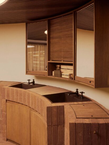
从附近教堂回收的白色瓷砖铺在地板上,与白色的墙壁和服务台相辅相成。在建筑低层发现的巴斯石碎片被放置在钢条上,在架子之间展示手工制品。同样的石头被用来制作厚实的面盆,顾客可以站在那里测试各种产品。每个都被五个小排水孔所点缀,以模仿在巴斯著名的皇家新月宫(Royal Crescent)的一个台地房屋中看到的厨房水槽的外观。
Pale tiles reclaimed from a nearby chapel are laid across the floors, complemented by white-painted walls and service counter. Rough fragments of Bath stone found in the building’s lower level have been placed on steel pegs and displayed artefact-style between the shelves.The same stone has been used to make chunky basins where customers can stand and test various products. Each has been punctuated with five small drainage holes to mimic the appearance of a scullery sink the studio saw in one of the terraced houses that form Bath’s renowned Royal Crescent.
颜色只出现在商店的外立面上,它被涂上了一层光滑的森林绿色油漆。在JamesPlumb重新设计之前,这栋建筑已经年久失修,这使得团队还需要对商店的内部结构进行一些更改。三扇窗户和一个以前用木板封住的楼梯已经被打通,使空间恢复到原来的乔治亚风格。
Colour only appears on the shop’s facade, which has been updated with a glossy coat of forest green paint.Prior to JamesPlumb’s redesign the building had largely been in a state of disrepair, filled with unsightly fixtures from previous shop fit-outs. This left the studio to also carry out a number of changes to the store’s internal structure. Three existing windows and a previously boarded-up staircase have been unblocked to return the space to its original Georgian proportions.
在楼上,一个以旧木桌为中心的图书馆被保存了下来,形成了一个“隐藏的家庭生活层”。也因此,JamesPlumb决定在零售空间内设立一个指定的阅读区域。
Upstairs, a library centred by a worn timber table has been preserved, forming a “hidden layer of domesticity”. JamesPlumb’s decision to have a designated area for reading within the retail space .
完整项目信息
项目名称:Aesop商店
项目位置:英国巴斯
项目类型:商业空间/零售店
使用材料:巴斯石、木材
设计公司:JamesPlumb
摄影:Aesop


