LOFT中国感谢来自唯想国际的联合办公项目案例分享:
在当下众多联合办公纷纷涌现的大潮下,联合办公不仅仅只是低成本、共享办公的一种选择方式,更多的市场竞争下对场所有了更多的要求,不同的客户群体也对空间有了不同欲望。
The project is a co-working space located in Shenzhen, which was designed by X+LIVING. The goal was to create a space which can accommodate multiple companies and give full play to the employees’ individuality, and let “co-working” no longer be just a synonym for “low-cost”.
∇ 1F大堂
小元里项目我们整体是在一个四层楼的空间,一层作为大堂接待;二层作为办公配套的餐饮空间;三四层为办公空间,其中三层主要是小型办公空间,针对的客群偏年轻化。四层主要是大型办公空间,针对的客群偏成熟。由于不同楼层所承担的不同的功能,因此我们在空间的调性上也做了明显的差异化。
The chief designer, Li Xiang, integrated artistic aesthetics and interesting visual effects into the four-storey space, and differentiated the tone and style of each floor based on functions.
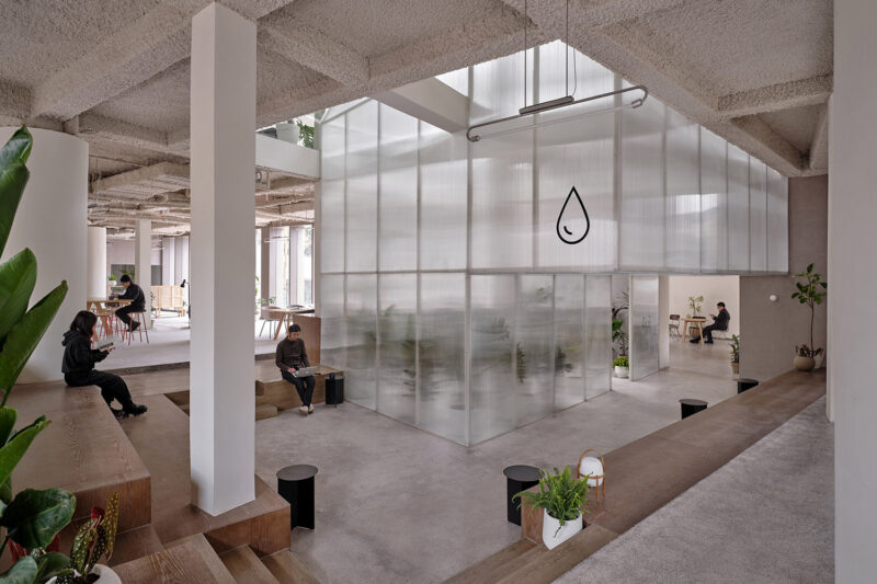
在一层我们设置了两个入口,南侧的主大堂空间,主要作为办公层的入口,主要承担接待问询的功能,我们留了很大的空白来体现大堂的气质。并且在内部我们营造了一个连通一到四层整个空间的内中庭,把建筑的外立面窗格做在室内,让人们在室内感受室外的建筑感,并且在扶梯的上升过程中能感受一到四层不同的空间美感。在大堂我们引用了水流的概念,黑白条地面水波纹的起伏,流动,象征着企业的承载和不断的前进。北侧的次入口,主要是餐饮层的入口,做了一个大型的热气球装置,作为视觉的焦点。整体白色的空间,为未来企业的宣传展示和小型展览留下无限的可能性。
1F serves as the lobby and reception area, with two entrances. The main entrance is on the south side, from which people can reach the main area of the lobby and the workspace. The secondary entrance at the north area leads to the dining space, featuring a large striking art installation with the shape of a hot-air balloon.
An atrium runs through the overall space. Besides, the window panes were embedded into the interior wall, making it appear to be the facade. When the escalator rises and passes through each floor, people can enjoy varying visual experience.
∇ 2F餐饮层
二层的餐饮层作为办公层的服务空间,我们把大部分的空间留给了商户,把设计点主要放在了走廊的端头墙面,利用彩色的背景墙面和一些餐饮相关的趣味家具和装置在视觉上吸引人们的眼球,同时起到和人们互动的作用。这些家具除了视觉上的吸引,同时也是餐饮层的共享桌椅和休息空间。
2F functions as the dining space. X+LIVING laid emphasis on design of the end area of the corridor. Colorful background walls, combined with interesting dining-related furniture and installations, add visual appeal to the space and allow interaction among people, space and articles.
∇ 3F青年联合办公
经过扶梯上到三层办公空间,在三层整体的布局上,我们分别在两个扶梯上来的空间作为公共客厅区域,并且把两个公共客厅用共享会议区、休息区串联起来,把需要比较私密安静的办公空间放在客厅之外。动静分离的布置,一方面让视觉点更集中,一方面也便于后期的运营管理。
从主大堂扶梯上来,首先看到的是work hard 的欢迎橱窗,然后转身会看到一个特别怪诞、艺术的公共客厅。这里我们引用了健身器械的元素进来,想要传达健康工作的理念。我们把单杠吊环意化成巨大的香槟金画框,当你穿梭其中就像置身于一幅幅画作当中,我们根据使用的行为模式,设计了多种座椅形式,宽敞的大沙发,一个人安静独享的座椅,休闲的吊椅,学习的吧椅长桌。当你在这里休憩工作时,也可以在旁边的单杠吊环拉伸一下。为了打造客厅的舒适感,我们设计了一些地毯,并且让它和墙面的画作结合在一起,让它不仅是装饰还是空间不可或缺的一部分。在客厅的边上是一条开放式的水吧空间,还有一个休闲玩乐的海洋球池。透过水吧区可以看到两幅怪诞的画作,梵高自画像的头部和蒙娜丽莎的手分别代表男女卫生间的标志。
穿过客厅到达共享会议室和电话亭休息间,会议室我们采用简练的硬装,不进行过多装饰,把投影机的盒子作为一个视觉亮点突显出来。电话亭休息区我们采用比较温暖的色调,考虑使用的舒适性,采用软包的坐垫和靠垫。
3F is a small workspace, targeted at young groups. The space around the two escalators is used as public reception area, which is connected with the shared conference room and resting area, and separated from the office that requires privacy and quietness. Such clear spatial layout makes the visual point more focused, and facilitates future operation and management.
As reaching 3F by taking the escalator from the lobby, people will be firstly welcomed by the words “Work Hard” on a show window, and then see the public reception area with grotesque artworks when turning around. X+LIVING utilized elements of gym equipment in the space to convey the idea of keeping balance between health and work. The champagne gold horizontal bars and rings are very eye-catching, enriching the spatial experience. Chairs were designed with diversified forms and shapes for the sake of serving different needs, including social interaction, leisure, learning and staying alone.X+LIVING designed several rugs in the public reception area, which not only echo the paintings on the walls but also make the space more comfortable and visually attractive. The open bar area and relaxing ball pool are on the side of the reception area. It is interesting that two paintings can be seen from the bar area. The head part of Vincent Van Gogh’s self-portrait and hands of Mona Lisa indicate the washrooms for males and females.
Passing through the reception area, people will come to the shared conference room and the telephone-booth-shaped resting rooms. The conference room is characterized by minimalist design, with the projector box as the highlight. The resting rooms were decorated with a warm tone, equipped with soft seat and wall cushion.
∇ 4F大型联合办公
四层作为大型办公空间,整体的布局上,同三层一样,分别在两个扶梯上来的空间作为公共客厅区域,大型的办公室环绕在客厅周围,让每一间公司都能快速的到达。客厅区域依然采用多种的座位形式满足不同的需求,公共的水吧空间也融合在这里,同时设置相应的私密休息空间。因为针对的客群的不同,在调性上偏成熟稳重,在空间里运用比较多的木饰面和灰粽色的混凝土饰面。家具也不同于三楼的怪诞色彩,更偏简练沉稳。这里我们也引用了健身器械的概念,很多卡座和坐凳都引用了按摩椅、瑜伽球的概念,提醒人们在工作之余也能关注一下自己的身体。
4F is a large workspace for mature and elite groups. It has the same layout as 3F. The space near the escalators also functions as a public reception area, with the large office area surrounding it, so that employees of each company can reach their working area very conveniently. The overall space on this floor was endowed with a sedate and mature atmosphere by use of wood veneers and grayish-brown concrete coating in a large area. The furniture was designed in a minimalist style. Besides, elements of exercise equipment can be found in the space as well, reminding people to pay attention to physical health after work.
∇ 洗手间
∇ 1F平面图
∇ 3F平面图
∇ 4F平面图
完整项目信息
项目名称:深圳小元里联合办公项目
项目地点:中国 深圳
项目面积:8800㎡
完工时间:2018.12
设计单位:唯想国际(www.xl-muse.com)
主持设计:李想
项目总监:任丽娇 吴锋
参与设计师:钱慧兰 陈雪 罗紫艳 范祺 刘汝琴 江雪萍
定制家具:XiangCASA
XiangCASA品牌部总监:Justin周 郑敏平
XiangCASA设计师:杨欢 高玲
项目摄影:邵峰 周玉强 胡义杰
Project Name: UNOVA CO-WORKING SPACE
Location: Shenzhen, China
Area: 8800 m2
Completion Time: December 2018
Design Company: X+LIVING(www.xl-muse.com)
Chief Designer: Li Xiang
Project Directors: Ren Lijiao, Wu Feng
Participating Designers: Qian Huilan, Chen Xue, Luo Ziyan, Fan Qi, Liu Ruqin, Jiang Xueping
Customized Furniture: XiangCASA
XiangCASA Directors: Justin CHEW, Zheng Minping
XiangCASA Designers: Yang Huan, Gao Ling
Photography: Shao Feng, Zhou Yuqiang, Hu Yijie


